Your perfect cup, ready when you arrive
Brand : Maple Coffee


Overview
Maple was a design challenge assigned to me by a company focused on machine learning behavior and adaptability. The task set was to come up with low-fidelity screens and wireframes to showcase the process behind how a regular Maple customer could place their order and collect it with minimal friction; just in time to reach their workplace.
Since it was a 1-day assignment, I focused more on using a daily office go-er's experience (a.k.a me) to understand their daily coffee/breakfast purchasing pattern to ease the process further.
I spent two more after the challenge's completion to polish up the screens and make the high fidelity prototypes.
User Behaviour
- Users are usually in a rush in the morning and want to avoid waiting in long queues.
- Some users have multiple orders which means more waiting time.
- The app needs to cater to both first-time as well as regular customers.
Initial Questions
Behaviour Questions:
When would users usually place their orders?
Do they need reminders to keep track of time?
Attitude Questions:
Would users like recommendations to add to their daily orders?
Problem
How might we enable Client Admins to have more control and ownership for their own company module, reducing reliance on the super admin, and eliminating delays and time wastage?
Concept
1) The intuitive process involves giving the user reminders based on their past orders taking the timing, preferences, process into account.
2) A quicker way to checkout than the longer, usual process on every food/beverage app would drive the user's motivation to order directly from the app.
User Flow

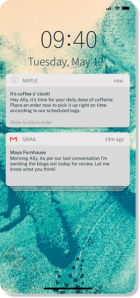
Push notifications
.png)
.png)
Repeat Order
(Collapsed)
Repeat Order
(Expanded)

Checkout
Order placed
Final Prototype
Push Notifications
-
The app is intuitive enough to remind users when to place an order based on past purchases.
-
This way, the user knows exactly when to place an order so it can be collected just in time.

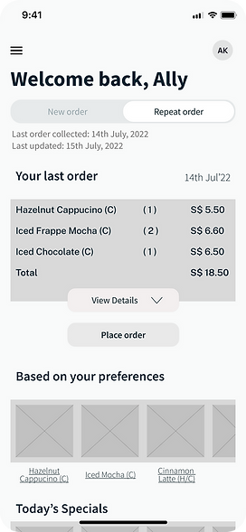
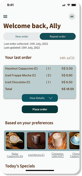
Homepage
-
Toggle feature to switch between new and repeat orders so users can save time.
-
The homepage accommodates new as well as returning customers.
.png)
.png)
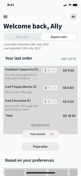
Repeat Order
-
If the user is in a rush, they can easily toggle to view their past order and go ahead with placing the same order without wasting time.
-
The extended version allows them to edit the order to add/remove any of the items from the repeat list as well.
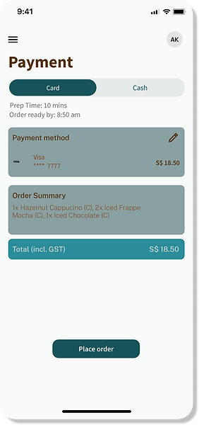

Checkout
-
The toggle feature is repeated to allow for either cash or card payment.
-
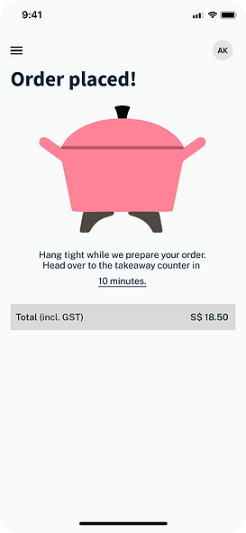
Even during placement of order, real-time data is used to inform the user of prep time and when the order would be available so the user can make an informed choice.
-
Once the order is placed, the user can check the app to see exactly how much time till their order is ready.